Apparently, changes are coming to the way shops look on Etsy. When I logged in this afternoon I saw this bright orange invitation to preview how my shop will look come April 5. I haven’t kept up with the Etsy forums so this was the first I knew of these changes. I have a few weeks to make updates before the changes go live.

This bright orange box showed up at the top of my shop home page. The way my Etsy shop looks is about to change. Again.
I’ve had a shop on Etsy since 2008 and there are always changes being tested or implemented. I think this latest change to the appearance of storefronts might have something to do with catering to mobile device users. That’s just my assumption. Maybe I should pop into a forum to get the official scoop? Meh, maybe later.
Some of the changes are things I’ve been wanting and others are things I’m not sure about. In the “finally, something I wanted” column is more item listings per page. There will be a 3 column by 30 row page of item listings, versus the current 4 column by 6 row layout. I think people are more inclined to scroll down a page than click arrows to get to the next page, and hope this will facilitate browsing within my shop. I also think the narrower format plays more to smartphone and tablet-sized screens.
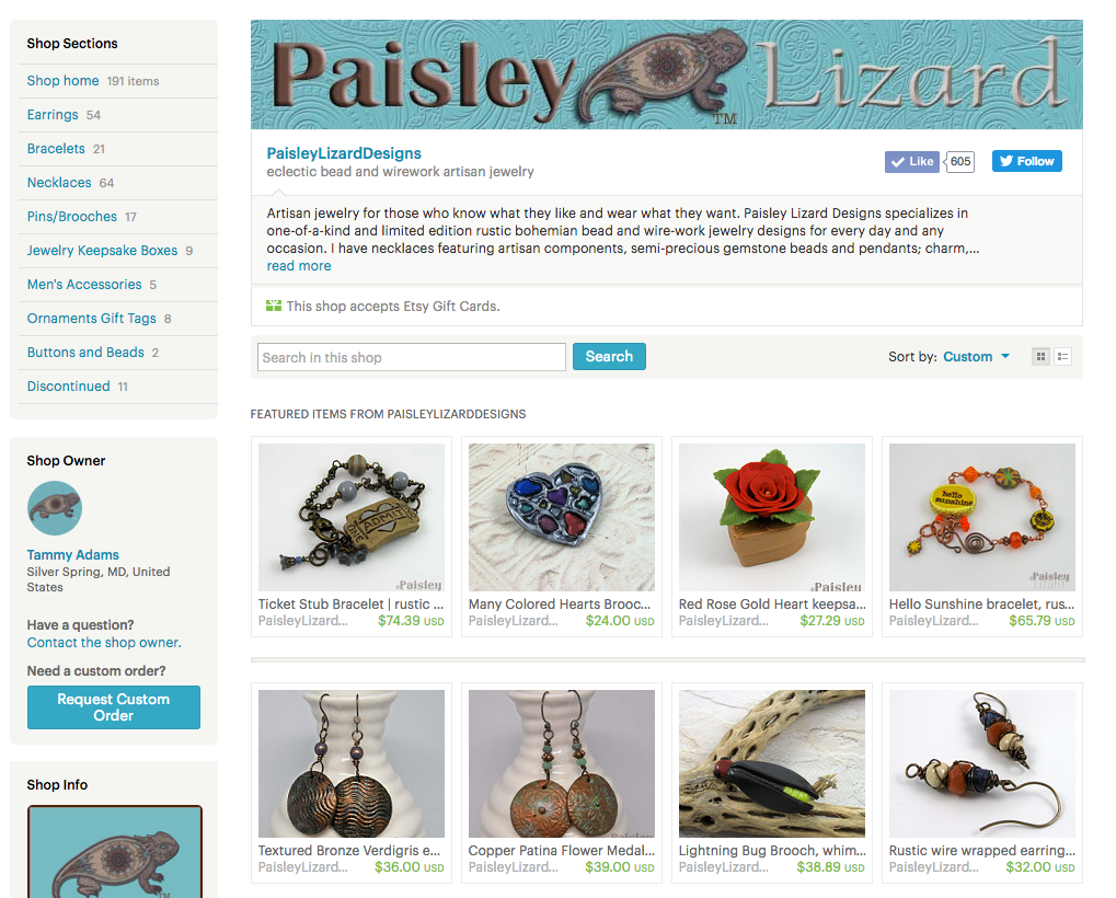
This is how my shop’s home page currently looks. There’s a banner across the top 2/3 of the page, the shop sections navigation is at the top left, and the items listings are in a 4 column layout.
One change in the “boo-hiss I really dislike that” column is the elimination of the shop banner at the top of the page. There will now be a 400 X 400 pixel shop icon in the upper left corner instead of the 760 X 100 pixel banner across the top. That’s less “square footage” for branding your shop at first glance. And less opportunity to showcase my totally awesome custom-designed Paisley Lizard logo. (Which reminds me that I need to update the banner here on my website.)
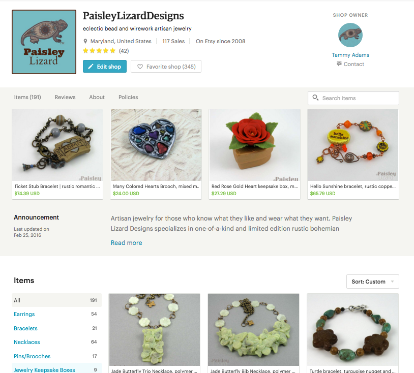
This is how my shop’s home page will look as of April 5, 2016. The banner is gone. Those top four photos are the “featured items” I choose to highlight. With “featured items” being given such prominent position in the new layout, I will definitely need to keep on top of what I choose to put there.
*Edit 16 March 2016. I wrote too soon. Today I found an option to “tour” the redesign in preview mode and I see there is not only an option to keep my current banner (although it will not be visible on mobile devices), but also a new option for a “cover photo” that can be 1200 X 300 pixels minimum. That’s quite a bit more “branding” space than the current banner. In fact, Etsy even refers to these as “branding option” settings. I’m not sure what I will do with all that newly available branding space. But I’m moving this change out of the dislike column.
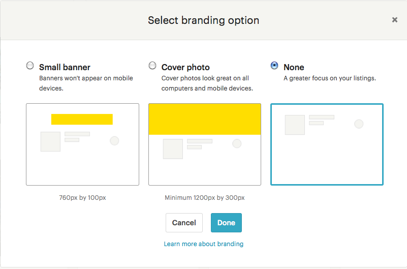
These are the new “branding” options for the image that will appear at the top of my shop’s home page. I’m thinking that middle one – “cover photo” – is the way to go.
Overall, the size of the images for item listings are larger in the new format. I didn’t find them too small in the current version, but I can assume the larger size works better on those smaller mobile device screens. I say “assume” because I do not use my phone to shop or surf the internet. I have a nice 23-inch monitor for that. And a keyboard made for human-sized hands rather than for the itty bitty paws of pet mice trained to type for me.
In the “I’m not sure how I feel about that” column is the overall move away from left-hand navigation toward a loooooong page with section breaks. Despite being a piler rather than filer in regard to how I organize my physical space, I like digital information nested away in folders and menus. The new format for the home page seems to be a continuous scroll from Shop Name, Featured Items, Announcement, Items, Reviews, About, and Policies. The only left-hand or nested-type navigation is the shop sections. (Which, btw, are growing from a maximum of 10 to a maximum of 15.) Again, I’m assuming this new scrolling vs. clicking page navigation works better for those on mobile devices.
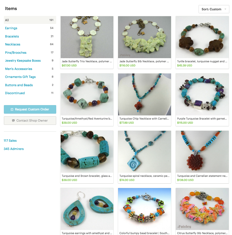
This is how the items and section navigation will appear in the new layout. I couldn’t get the whole page in one screen shot because it’s too long. The next photo shows the bottom of this section – but that’s not the bottom of my home page. Not by a long shot.
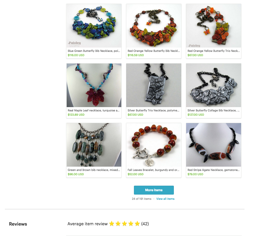
This is the bottom of the Items section in the new home page layout. When you click the “More Items” button you get a 3 X 30 matrix, with page numbers at the bottom if you have more than 90 items total. Or you can keep scrolling on the home page to see the Reviews section.
This is not a complete break down of all the changes coming to my shop’s home page on Etsy. Nor is it likely the end of changes Etsy will make to how shops look or function. The world is changing, and so are they as a company. I know some of their changes have resulted in artists leaving the site and setting up shop elsewhere. I’ve tested a few other options, and ultimately want a shopping cart here on my own website. I’m not ready for that leap yet.
Until then, I hope you’ll stop by my little corners of Etsy now and again to see what’s new. And by “new” I mean the awesome original handmade jewelry I make. You can find my “eclectic bead and wirework artisan jewelry” with a rustic flair at PaisleyLizardDesigns. Or, if you prefer something more “whimsical romantic” with a bit more sparkle, hop over to the CactusFrog.

I love your take on this, and my thoughts mirror yours. I love that the new branding cover image makes my shop feel more like my store. Yes, I know that I am just a page on etsy’s site, but still this change makes for a different feel when you go to each shop… I too think all of these changes are to make the site more user friendly for smartphones and tablets. But I too wouldn’t personally know about that, as I don’t own either, and I never surf the web with my iPod touch… human hands here too, with no trained mice. 😉 You made me laugh out loud with that one!
I’m glad I made you laugh, Beth. 🙂 I’m excited about the cover photo, while also at a loss as to best way to use it. Branding is such a tricky “first impressions are everything” situation. And my graphic design skills leave much to be desired. But hey, it’s an opportunity to experiment.