As I head into my third month participating in the Self Representing Artists in Jewelry Design theme challenges, I am still on a roll with the polymer clay. The overall theme for May is Greek gods. The sub-theme for the first week is “Apollo, god of the sun, light, and healing.”
I have been a fan of mythology since childhood. Loving the theme for this month doesn’t necessarily make it less of a challenge for me to come up with jewelry designs that personify gods, which themselves embody human emotions and characteristics. But I am having fun, especially dusting off my mythology books and reminiscing about my world views when I fist got hooked on the subject.
Without getting into the complexities of Greek versus Roman mythology, the chronology of cults for Apollo and how his attributes varied among them or over time – there are shelves of books about all that – one thing Apollo was known for in some circles was pulling the Sun across the sky each day in a golden chariot. That’s the attribute I went with for my jewelry design inspiration.
I wanted a color scheme that represented the daily transition of the sky from dark to light and back again as the sun rises and sets. Sunrises and sunsets come in a vast array of colors, some including pinks and purples, and I could think of no medium better than polymer clay to give me the color options I would need. And no technique better than this color gradient tutorial from The Blue Bottle Tree to help me make just the right amount of each color.

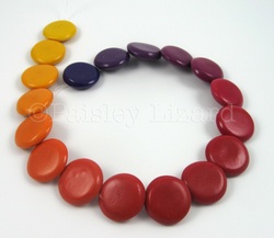
Color gradient coin beads.
My original plan was to make overlapping coin beads that transitioned gradually from bright yellow through vibrant reds to dusky purples and blues. I started making beads and realized I was making a rainbow more than a sunrise. Plus I didn’t know how to pierce beads to make them overlapping since I’d never seen any in person.
Plan A resulted in some pretty beads that don’t quite overlap the way I intended and don’t really make me think “sunrise” or “sunset” but do make me think of candy.
Plan B involved going to a local bead store to scope out exactly how overlapping coin beads are pierced and then mixing up some more color gradient, minus the blue. But then I ran out of time to get to the store because …okay, fine, I slept in that day.
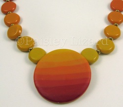
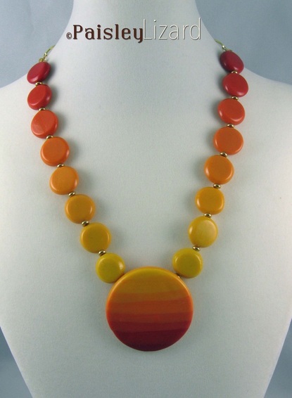
Enter Plan C wherein my beads don’t overlap, but they get a nice central focal to play off of. I combined the color gradient tutorial with this controlled marbling tutorial from Diva Designs, Inc. to make my focal. I could have made a Skinner blend for the focal. But I didn’t want a gradual transition of color, I wanted a stepped transition. And I wanted to be able to control the width of the steps. Combining these two tutorials let me do exactly that.

Polymer clay color gradient beads and striped pendant.
I rarely use gold or gold tone metals in my jewelry designs. I made a special exception for Apollo, because he’s a god and all that. I used some gold-plated rondelles to separate my non-overlapping coin beads. And some gold tone chain links with a gold-plated clasp to finish off the back of the necklace.
I also used a different kind of pendant bail for the focal. I made a hollow tube of clay and glued it to the back so the bead wire runs behind the pendant rather than through or above it. The pendant is in line with the necklace rather than dangling from it. Plan C turned out better than I hoped. Sometimes the “third time’s a charm” as they say. I call this piece “Sunrise Sunset” and hope that’s what you see when you look at it.
I also hope you’ll subscribe to this blog (by RSS feed, email subscription, or feed servers linked in the right column under my photo), follow me on Facebook, join me on Google+, and tune in to my Twitter feed to see what I design to represent “Artemis, goddess of hunting, wilderness, wild animals, childbirth, and the moon” for next week’s challenge. And to get updates on my newest jewelry designs, sales in my Etsy shop, and other jewelry design adventures from Paisley Lizard.

You know it’s funny, but I did the same thing with the sunrise/sunset colors and used the controlled marbling to get a veneer. It was a…shall we say…learning experience. But I saved all the colors because I want to revisit it someday. I think yours turned out beautifully. I’m still in love with your smooth workmanship here. They’re like perfect little smooth pastilles.
Well, that just proves great minds do think alike. 🙂 I baked up little tiles to save the color recipes. As long as Sculpey doesn’t discontinue cad yellow and fuchsia, I am all set.
I love this piece Tammy! I can see this being a favorite choice for summer wear! The color blends are gorgeous, and as Ginger said, your finishing is perfect!
Thank you, Beth. I guess it does say “summer” with those bright warm colors.
I came over to see your BSBP reveal and look what I found! These beads are gorgeous and I love love the graduating colours especially in the main focal.
Ok, now over to the reveal…..
Hi Clare. Thanks for looking around while you were BSBP hopping.