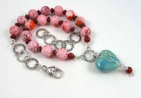
Sometimes I take my jewelry apart and re-do it. I don’t like to. It feels wasteful to cut off crimps and things that can’t be re-used. Sort of like ripping seams out of a costume when I sew. Can’t re-use all that thread.
But sometimes, seams have to be ripped and crimps have to be cut. Because the design just doesn’t work or didn’t come together the way I envisioned.
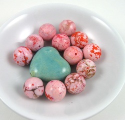
The inspiration beads.
Take this necklace for example. I had these luscious 14mm round bubblegum pink dyed magnesite beads for weeks. I kept staring at them, waiting for design inspiration. When I rediscovered some turquoise ceramic hearts while searching for something else, I knew they and the bubblegum beads were meant for each other.
But how to put them together? I immediately thought of two possible layouts. One was to string the heart in-line with the round beads for an asymmetric design. The other was to use the heart as a central focal pendant. I decided on the pendant idea and went back to my bead stash to see what else I could add to the mix.
I pulled out my box of pink beads, and found some pale frosted glass and fire-polished crystal that looked like they would play nicely. I also rounded up some turquoise beads, thinking maybe I would carry the color of the pendant back up into the necklace. And I tried some light lavender dyed howlite beads that were of about the same color value and intensity as the heart and the magnesite.
Ultimately, I decided my pastel palette needed a little punch. So I dug out some bright cherry red dyed howlite. Looking at the beads and focal on my design board, I also decided the heart needed a little something. I used some fancy twisted silver wire to wrap the hear and add a cherry red beaded dangle.
I laid out my beads and pendant on the design board, liked what I saw, and strung them up. Before I attached the clasp, I decided the design needed more metal, and that the necklace wasn’t long enough. I cut apart a silver bracelet and added some links to the necklace ends. Perfect. Or so I thought until I put it on and looked in the mirror.
Something was off. Out of balance. Not quite right. I couldn’t put my finger on it, but for some reason I felt I needed to add a bow above the heart. Maybe a fabric one. But preferably a silver metal one. Before I went shopping for ribbon and bows, I took some photos and converted them to black and white. I learned from a friend that sometimes taking color out of the equation can help identify design flaws.
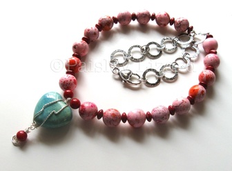
The original necklace in color.
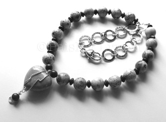
And in black and white for design diagnosis.
I was almost certain the color wasn’t the problem – the pink, red, and turquoise all looked so happy together. After staring at the black and white photo a bit, I was nearly convinced I needed to go bow shopping. There definitely needed to be something between the pendant and the necklace. Turns out they just needed a little space. Which I didn’t figure out on my own.
I sent the photos – the B&W and the color version – to that brilliant friend via email. She’s taken her fair share of design seminars, and is an expert in color. In fact, people pay her to tell them what colors to use in their designs. Not jewelry: rooms, houses, office space, etc. If you live in the VA-MD-DC area and need a little color consultation, you should definitely look her up: Beth at Beyond White.
Beth’s immediate reply to my email was that there needs to be space between the pendant and the necklace. Du-oh. (forehead smack). A bow could certainly do that. But better yet, let’s take some of that lovely chain from the back, where no one can see it, and put it up front. And voila, much better balance.
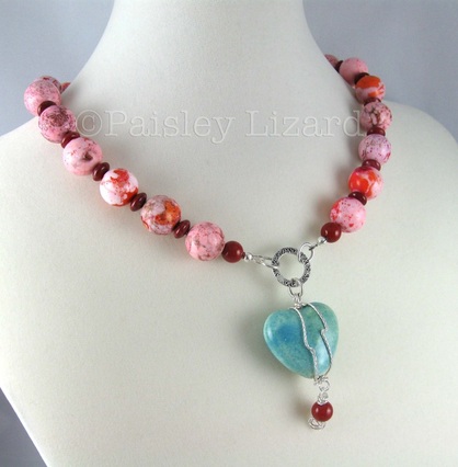
The re-designed necklace with a different focal attachment.
Of course, every necklace needs some earrings. I could have just popped one of the bubblegum beads on an earwire for a matching drop. Or dangled a red and pink bead from a silver link.
But I don’t care for matchy-matchy jewelry. I like things that coordinate or complement, and can hang out together because they have something in common without being exactly the same. That’s where some dyed coin beads came in. They are a peachier shade of pink than the magnesite in the necklace. But still the same basic color value and intensity. And since I had already dug those pretty pink crystal beads out, why not add a little sparkle. I think the sparkle of the crystals echoes the shimmer of the etched chain links nicely.
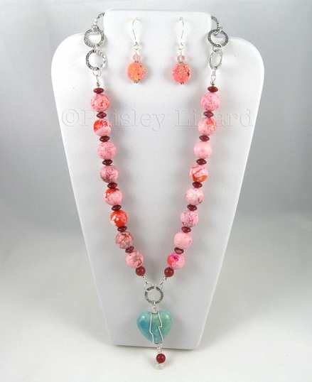
Necklace with coordinating (not matching) earrings.
I love the final combination. I have more bubblegum pink beads, and a few ceramic hearts. Maybe I will make another necklace with them. Not the same as this. I don’t like to duplicate my designs. Perhaps next time I will try that asymmetric idea, or put more chain in front. Stay tuned here and follow me on Facebook to see what happens.
